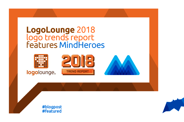
LogoLounge 2018 Logo Trends Report features Mind Heroes
I am very happy and honored to share with you that my Mind Heroes logo design symbol was included in the 2018 edition of LogoLounge Logo Trends Report
“It’s important to note that trend is not a bad word, and it doesn’t equate to trendy, as in here today, gone tomorrow. The logos featured here are on the outer-edge, influencing the next big thing. Much of it is experimental, which ultimately pushes design to the next evolution. We all live by trends—whether it’s fashion, food, or design. We like them and we adopt them because they make life more diverse and fun, even as they evolve and change. The key takeaway from this is not to imitate, but to find a way to push these ideas forward and make them your own.”
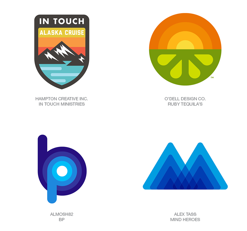
My M letter mark / logo design symbol created for Mind Heroes was included in the FATTY FADE category of this year’s trends.
“Smart designers understand that the past and the future are inextricably connected and that if you’re clever enough, you’ll call your appropriation a discovery. The seminal textile design of Verner Panton in 1971, launched an era of wall art and carpets that swayed, curved, and zagged with concentric stripes of vivid, stepped colors. Saul Bass notably used the same effect many times to smart success in the ’70s, including the brilliant Paul Harris Stores logo. Though similar to the ombré trend of the 2016 report, the momentum here is with strong stepped geometry.
This is an analog gradient that’s fresh and vibrant to a new generation of eyes with a hint of retro for a kicker. Aaron Draplin has done as much as anyone to rekindle this genre with a more contemporary aesthetic to its application. The resurgence comes with invigorated thinking and applications that blend the stripes with diverse elements that make for much richer solutions.”
You can find out the rest of the identified categories on the original LogoLounge 2018 Logo Trends Report post https://www.logolounge.com/articles/2018-logo-trends


