About the client:
RED is a new division incorporated and part of AMD, one of the global leaders in high technology.
A computer manufacturer and technology developer company, RED will produce high end servers, workstations, desktops, gaming workstations, gaming consoles and gadgets. They will also provide private cloud solutions.
We offer a more customizable solution with wider hardware portfolio and more high end product not focusing on the price.
My approach:
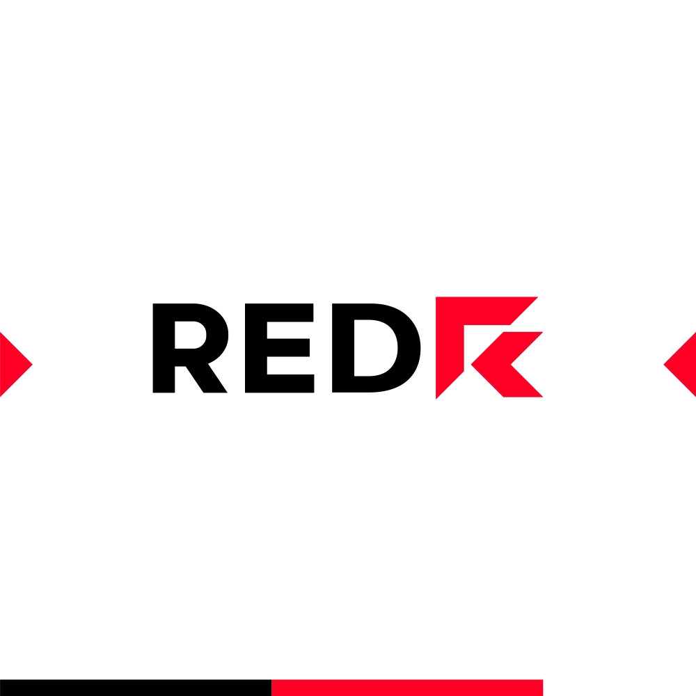
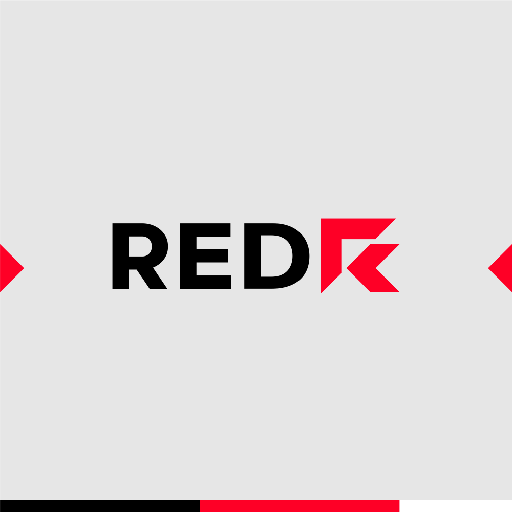
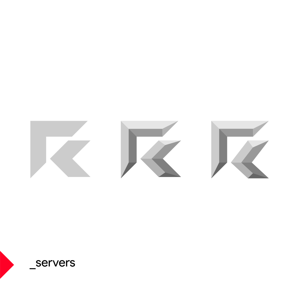
Despite being part of AMD, RED name and logo will be used without including the parent company name or logo. Considering this, in order to keep a connection as strong as possible with the AMD umbrella brand I created the new RED logo by using the AMD symbol parts and with their help I have created an R letter mark. In order to have a solid end result I have readjusted visually the width and length of the elements.
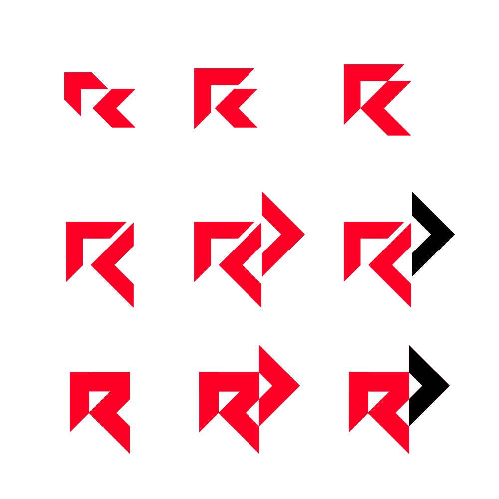
I have explored a few different possible constructions based on an uppercase R, considering even the possibility of including within in an abstract manner all the 3 letters of the new division name with the D letter doubling it’s role as a forward arrow.
For the wordmark / logotype I have also researched a similar solution to the parent brand.
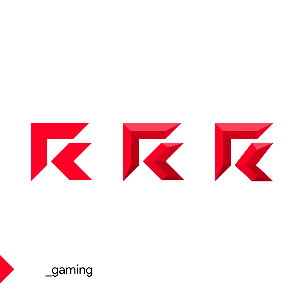
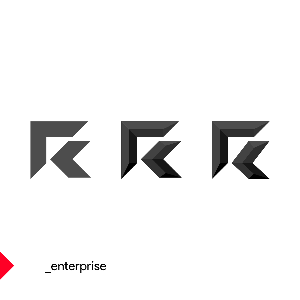
Besides the main logo, 3 secondary symbols / icons featuring the lettermark will be used for the company divisions, Gaming, Enterprise and Servers. Each division will feature a distinct color, red for Gaming, black for Enterprise and gray for servers. For these logo variations I have also created a 3rd feel treatment based on the client request.
Client:
RED / AMD
Deliverables:
Logo design
Status:
Not Implemented
Year:
2021
Tags:
RED, AMD, computers, servers, desktops, consoles, gaming, technology, developer, manufacturer
Related links:
– soon

